Vesperion
Well-known member
- Joined
- Feb 24, 2010
- Messages
- 1,819
- Reaction score
- 587
- Server
- Askone
- Main Pilotname
- Vesperion
- Rank
- 99
Following Fissions request to make this an offical Feedback Topic here i go with it.
Some of you might already have seen read this but i will give an short explenation here again.
Basicly it all came up by this Thread "HP Rankging of Tau Ceti Ships" about an recalculation of the "HP" from each Parsec/RDX/TC Ship that is currently in the game https://forum.pirategalaxy.com/viewtopic.php?f=320&p=201721#p201674.
The thing is that these are no offical confirmed number by Splitscreen and are more or less assumptions about the HP of each ship that have been given by Thermoblast testings cus from all weapons it´s the only one with an consistend dmg cus it has no min-max dmg along with no crits as well.
According to Fission Split didn´t want to "overwhelm" newer players with "to much numbers at the very start of the game".
Anyhows i wanted to share the idea about a little HUD rework that would allow us to get real numbers so that compares of HP and dealt dmg would be way easier to determine cus numbers give us at least some sort of idea if the next shot could kill a unit or not. The link below each Pic is the enlarged version for a better view.
First of all the Box were we type our msg would have to move to the left side right under the Chatlog (i have heared about rumors that some pilot have the Chat window open anyways so they move this freely around anyways)

https://up.picr.de/37903396js.jpg
Afterwards with the available space the HP Bars could take this place without "destroying" the current HUD to much and so can keep the overall look of it (don´t mind the different colours and stuff i needed to make a bit of an "collage" to show it)

https://up.picr.de/37903397ei.jpg
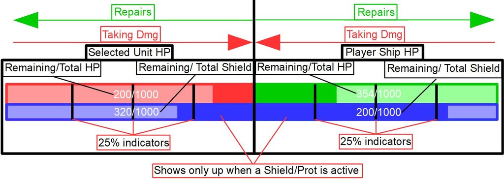
Here a small explanation of the HP Bars and how they should work at the end. I used simple numbers cus i was to lazy with higher ones at that point + i admit white colour on green background might not be the best choice but for the moment it should just deliver the gist of the HP Bars and at the end Split would decide what the final colouring will be.
I don´t know why but for some reason i like the idea of HP bars that go directly into the middle rather then depleting them into the same direction.

https://up.picr.de/37903398ng.jpg
I was thinking about the idea to add also small indicators above each Bar to show if an actuall Buff (att-charge (Red Up-Arrow ), Aim (target), Scram ("White Fog"), RD/RT/RF (Wrench))/De-Buff (Taunt (Red Skull), Stun (Blue Flash), Dome (Blue Ball), Thermo (Flames), MT (Magnet), CC (Purple cloud)) should be shown as well cus we all know that during many buffs/De-buffs in a short moment the animation won´t stop properly and continue to play after the effect has worn off.
Aside from that feel free to leave your thoughts/Ideas/addition suggestions about this and again nothing about "Split doesn´t care about such things anyways".
Regards - Vesp
Some of you might already have seen read this but i will give an short explenation here again.
Basicly it all came up by this Thread "HP Rankging of Tau Ceti Ships" about an recalculation of the "HP" from each Parsec/RDX/TC Ship that is currently in the game https://forum.pirategalaxy.com/viewtopic.php?f=320&p=201721#p201674.
The thing is that these are no offical confirmed number by Splitscreen and are more or less assumptions about the HP of each ship that have been given by Thermoblast testings cus from all weapons it´s the only one with an consistend dmg cus it has no min-max dmg along with no crits as well.
According to Fission Split didn´t want to "overwhelm" newer players with "to much numbers at the very start of the game".
I can somewhat agree with that factor and would say an easy solution for this "overwhelming" part would be to simply lock the "real" numbers behind the Story progression considering that we lose our Antares ship at the start of the game and so we lost most of our tech with it. So i would say keep the numbers and stuff out until either we have an Rank 10 ship or until we have reached Antares and then give an small Tutorial about the numbers cus most players should until Rank 10 or Antares have at least basic knowledge about the ground mechanics.Fission said:It was already said somewhere in the forums by devs that they tried to give less numbers as possible to simplify and dont make the game overwhelming for new players. Obviously veterans would prefer more stats. But thats like other games where having a big amount of numbers difficult players to understand the mechanics. [...]
Anyhows i wanted to share the idea about a little HUD rework that would allow us to get real numbers so that compares of HP and dealt dmg would be way easier to determine cus numbers give us at least some sort of idea if the next shot could kill a unit or not. The link below each Pic is the enlarged version for a better view.
First of all the Box were we type our msg would have to move to the left side right under the Chatlog (i have heared about rumors that some pilot have the Chat window open anyways so they move this freely around anyways)

https://up.picr.de/37903396js.jpg
Afterwards with the available space the HP Bars could take this place without "destroying" the current HUD to much and so can keep the overall look of it (don´t mind the different colours and stuff i needed to make a bit of an "collage" to show it)

https://up.picr.de/37903397ei.jpg
Here a small explanation of the HP Bars and how they should work at the end. I used simple numbers cus i was to lazy with higher ones at that point + i admit white colour on green background might not be the best choice but for the moment it should just deliver the gist of the HP Bars and at the end Split would decide what the final colouring will be.
I don´t know why but for some reason i like the idea of HP bars that go directly into the middle rather then depleting them into the same direction.

https://up.picr.de/37903398ng.jpg
I was thinking about the idea to add also small indicators above each Bar to show if an actuall Buff (att-charge (Red Up-Arrow ), Aim (target), Scram ("White Fog"), RD/RT/RF (Wrench))/De-Buff (Taunt (Red Skull), Stun (Blue Flash), Dome (Blue Ball), Thermo (Flames), MT (Magnet), CC (Purple cloud)) should be shown as well cus we all know that during many buffs/De-buffs in a short moment the animation won´t stop properly and continue to play after the effect has worn off.
Aside from that feel free to leave your thoughts/Ideas/addition suggestions about this and again nothing about "Split doesn´t care about such things anyways".
Regards - Vesp
